Lighting Bases Guide for Ask The Maker
Aug. 16th, 2018 03:39 pm![[personal profile]](https://www.dreamwidth.org/img/silk/identity/user.png) tinny
tinny
Requested by
ella_rose88 at ![[community profile]](https://www.dreamwidth.org/img/silk/identity/community.png) icontalking's 2018 Ask The Maker activity.
icontalking's 2018 Ask The Maker activity.This guide is a list of methods you can use to lighten a cap. Most of these are not Photoshop-specific, except the good ones. ;)
I.e. the caps I despair over are usually only possible to lighten well using Soft Light or Gradient Maps, and both are exclusive to Photoshop. (ETA: apparently PaintShop can do them as well, just that Gradient Maps are called Local Tone Mapping there.)
I'm using this (terribly dark) Teen Wolf cap:
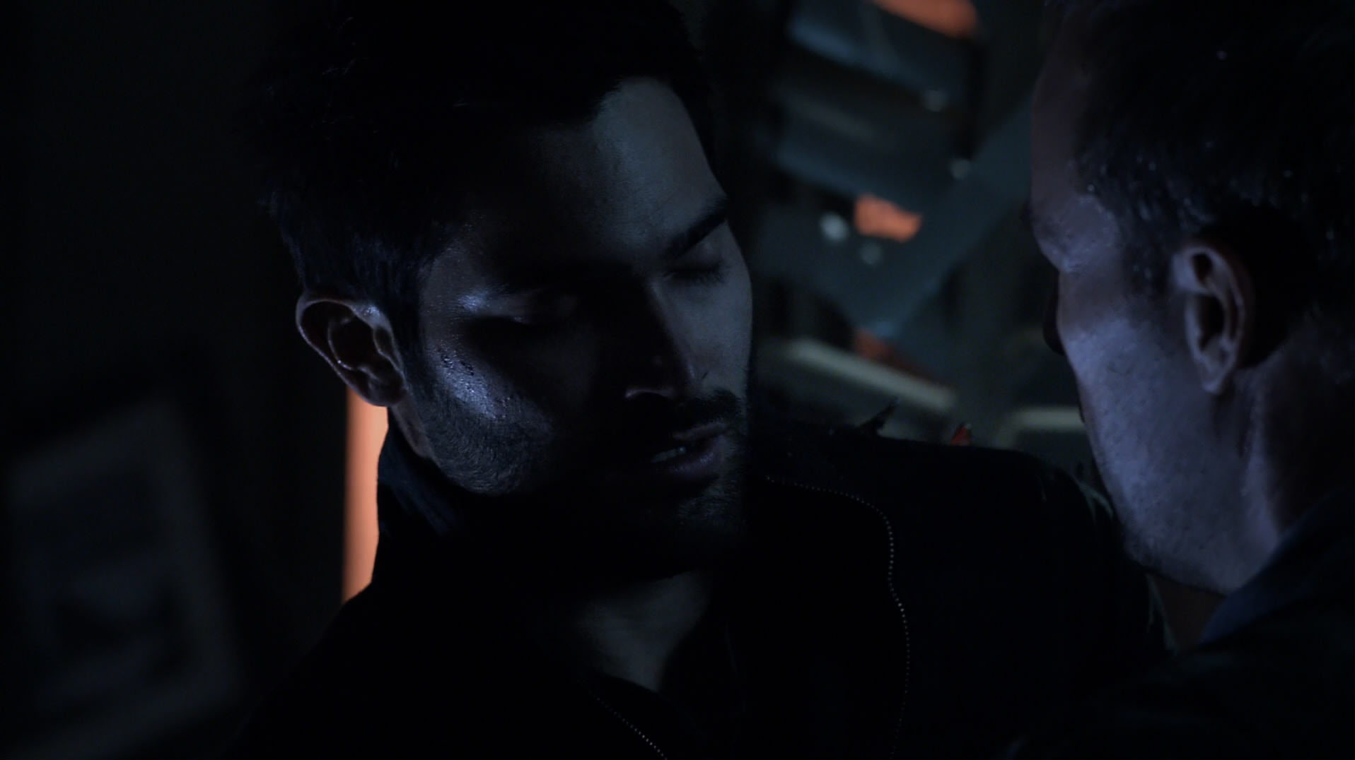
This is an 1920x1080 HD cap I just resized to streamline the post. Right-click and choose "View Image" to see at original size.
1. Curves and Brightness/Contrast
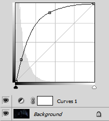
Standard methods are Curves and Brightness/Contrast. Always use adjustment layers instead of modifying the layer!
These two methods are not very subtle and often skew the color of the cap towards red. The amount/exact adjustment points differ for every cap.
You have to experiment! Stop before the hightlights get washed out. For an example for washed-out highlights see number 3 below.
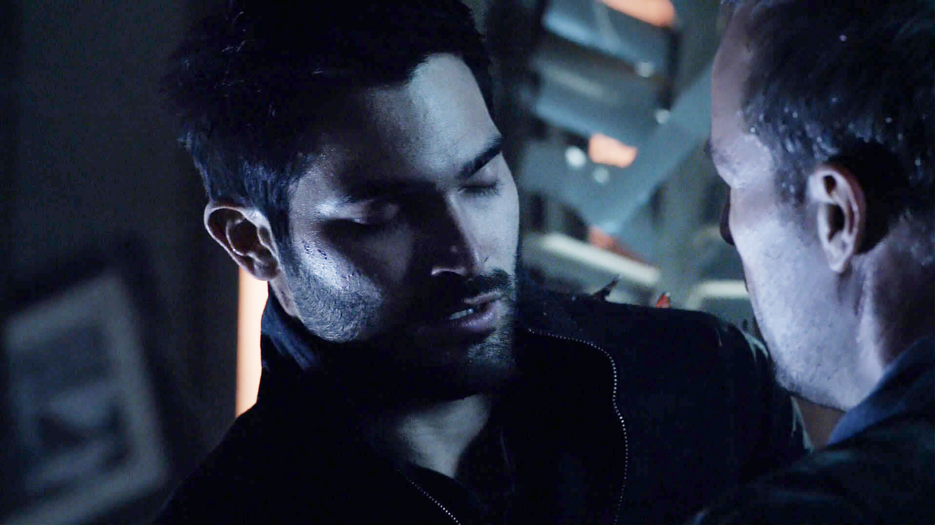
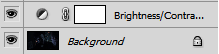
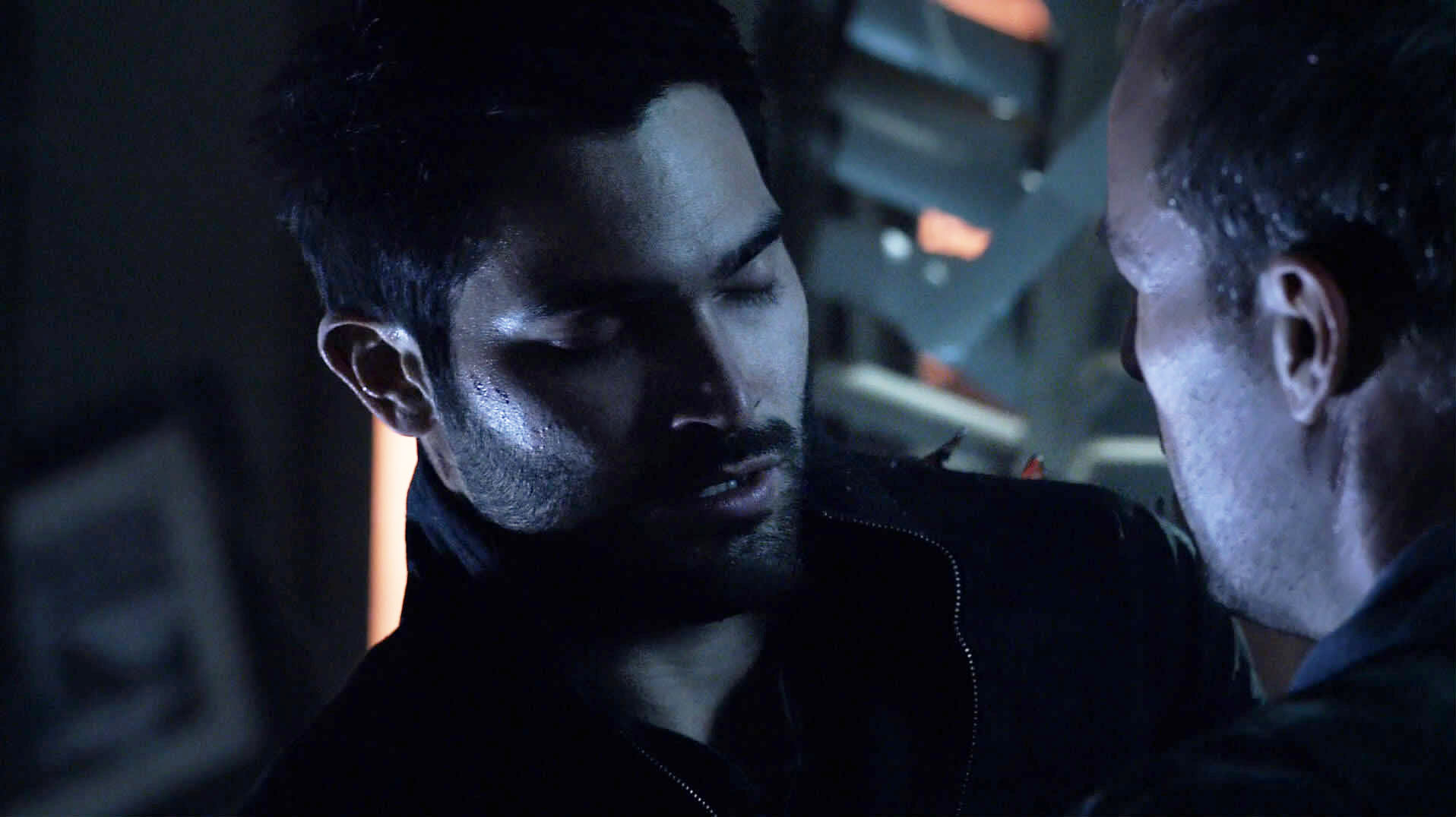
Problem with these methods is that you can't combine them well. If you try to add these adjustments twice, the result will be too light, too noisy, too red... . So they work okay for not-too-dark caps but I don't like the result here. It's simply not light enough yet.
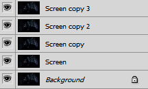
2. Duplicate the layer and set to Screen
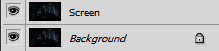
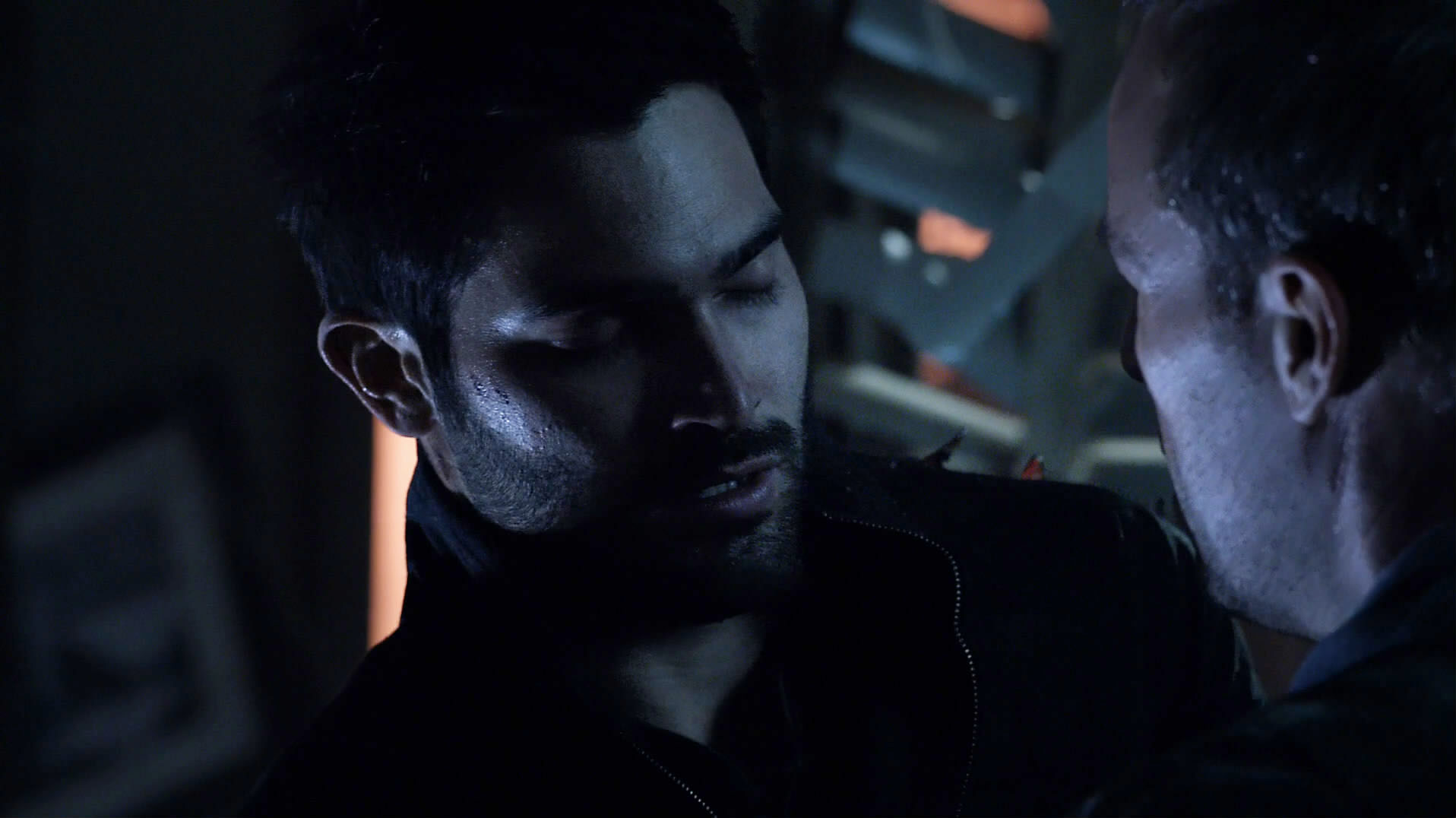
This is something you can do more than once without it getting too noisy or red. Change the opacity of the last copy if necessary.
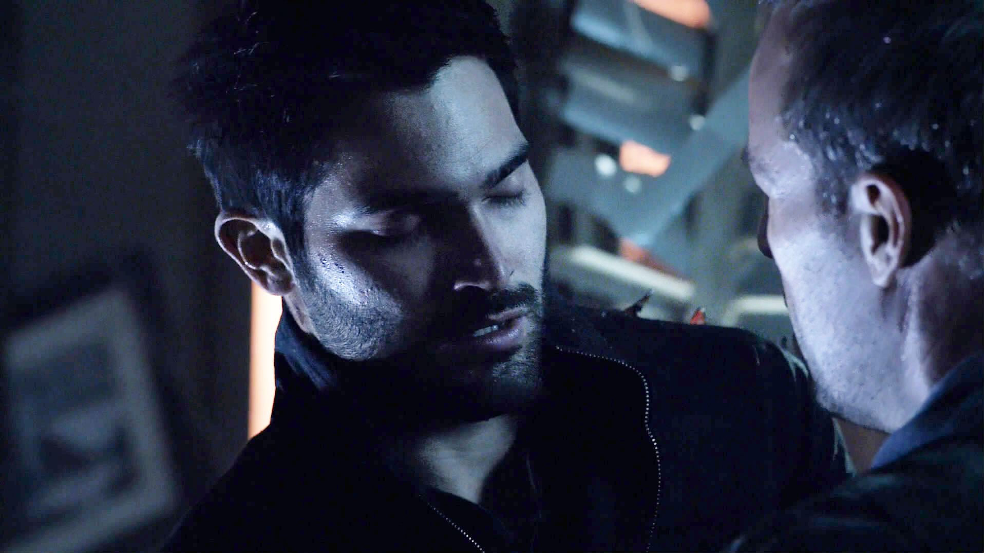
The color will get a little red, which you can see well in Sheriff Stilinksi's face. It doesn't get washed out as fast, though.
3. Linear Add
If Screen isn't enough, I love to use Linear Add. (Actually, I always use Linear Add.) It is way more powerful than Screen, so you have to lower the opacity a lot. 10% is enough for most caps. (Not this one...)
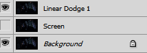
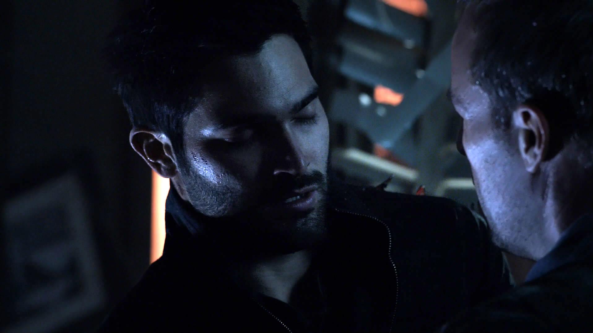
You can tell that this brightens the cap up much faster than Screen. But: just like all the other methods, if you do this too much, the image will get washed out. Here's what happens if you do this twice:
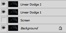
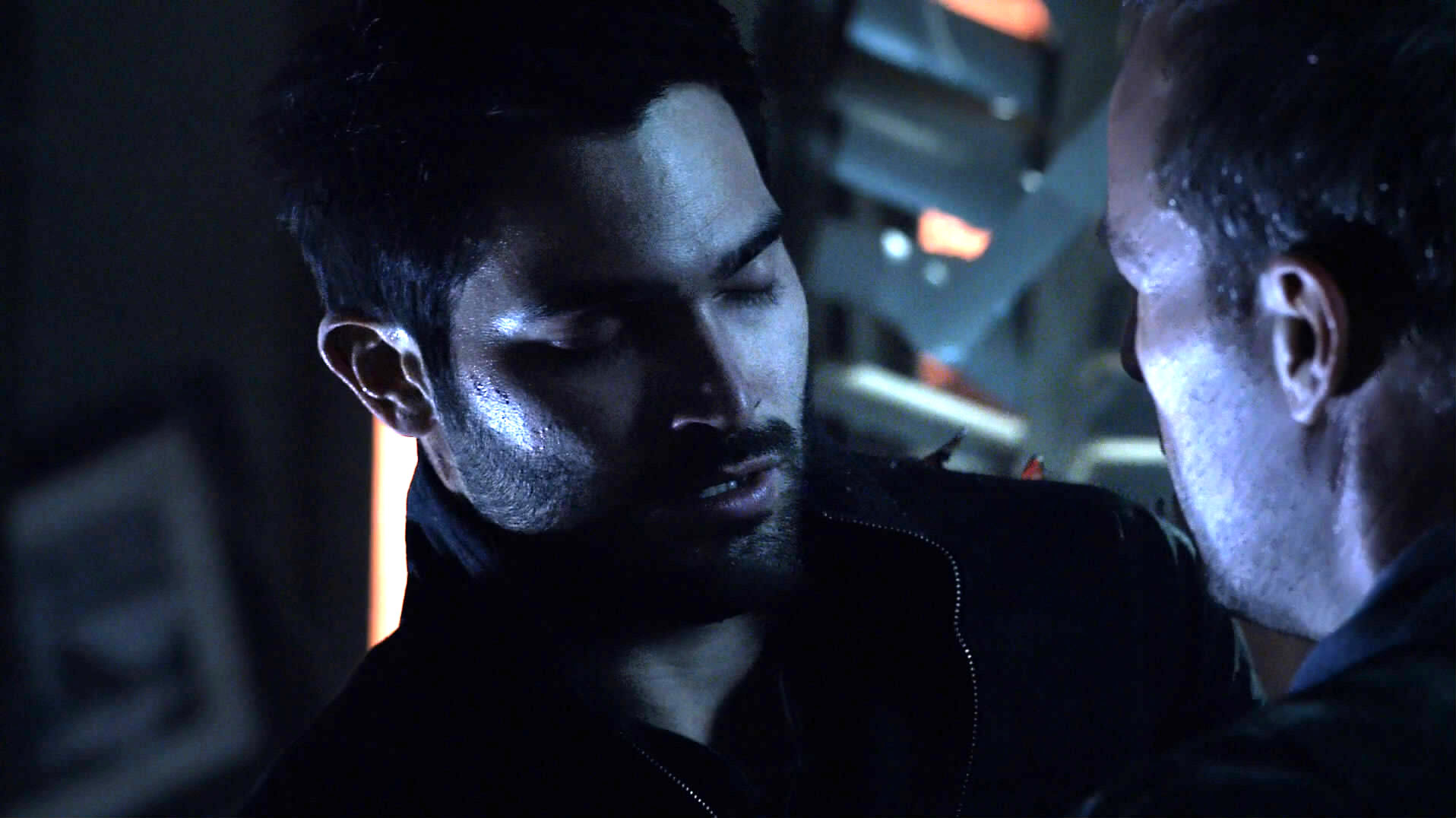
Derek's cheek is just about to become washed out, Sheriff Stilinski's face is already too bright.
4. Inverted Soft Light + Screen
Now for the one that really makes a difference: Soft Light is a great tool! It brightens the image where the layer is bright, and darkens it where it is dark. If you duplicate a layer and set it to Soft Light, the contrast will be increased (dark parts get darker, bright parts get brighter). In this case, we want the dark parts to get lighter, so we invert the layer first!
I started with the image already copied and set to Screen (from method 2 above) :
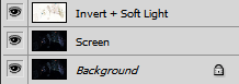
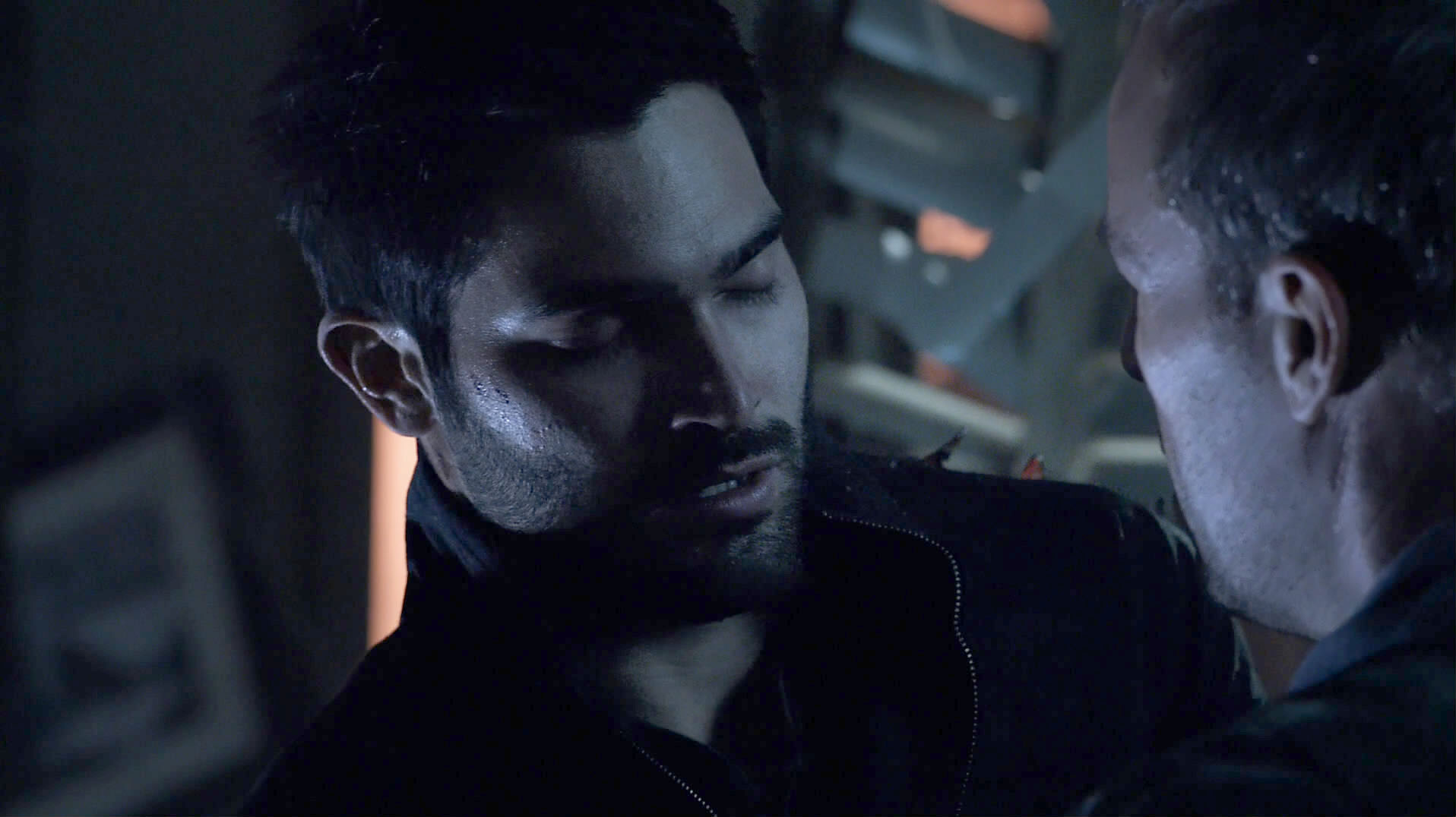
The same with the Inverted layer duplicated:
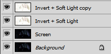
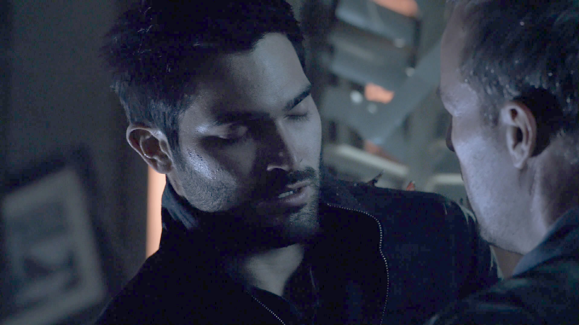
This is finally light enough, yay! And no bright smudges anywhere, and the color stays correct, too! What this method does is decrease contrast, though. So if you don't like that, you can lighten/adjust this cap further with any of the above methods.
5. B/W Gradient Map + Screen
Another good method is the Gradient Map adjustment layer. In this example, I used the plain B/W Gradient. Again, I started with the image already copied and set to Screen (from method 2 above) :
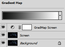
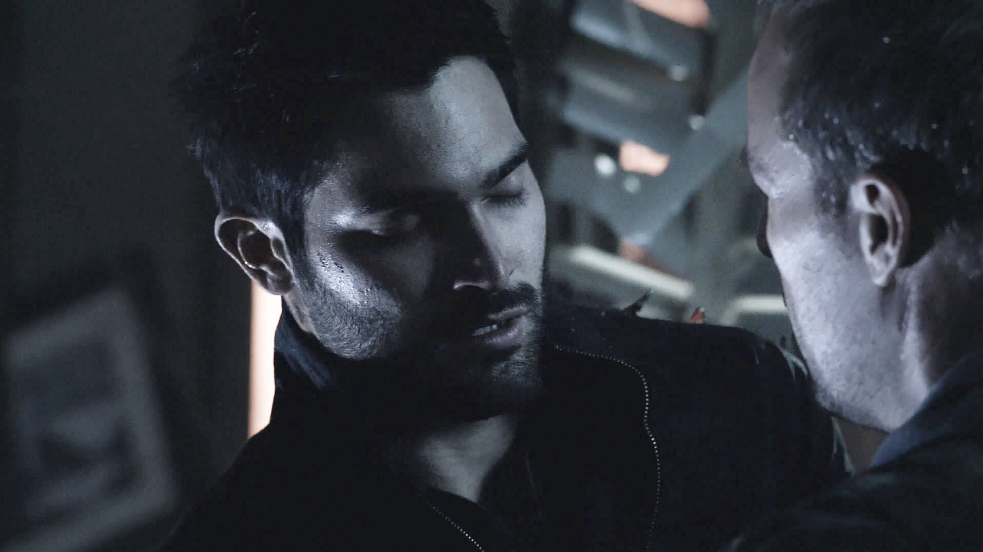
B/W Gradient Maps will desaturate your image. Better than red, in my opinion, but it depends on the original cap and what kind of coloring you want to achieve. If you don't want it to be this desaturated, try choosing a colored gradient in the hue you want to achieve.
6. B/W Gradient Map + Soft Light
If you want to lighten the darker parts without making the light parts too bright, setting the Gradient Map layer to Soft Light is the solution. This is similar to Invert+Soft Light, but you are more flexible since you can choose different Gradient Maps, not just the image or a black-white gradient. The first example is with a B/W gradient. Make sure white is on the left side of the gradient and black on the right.
Remember, Soft Light will lighten the image where the layer (in this case, the adjustment layer) is white and darken the image where the layer is black. The Gradient Map maps to the histogram of the image, so white on the left side of the Gradient Map means lighting the dark parts.
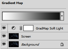
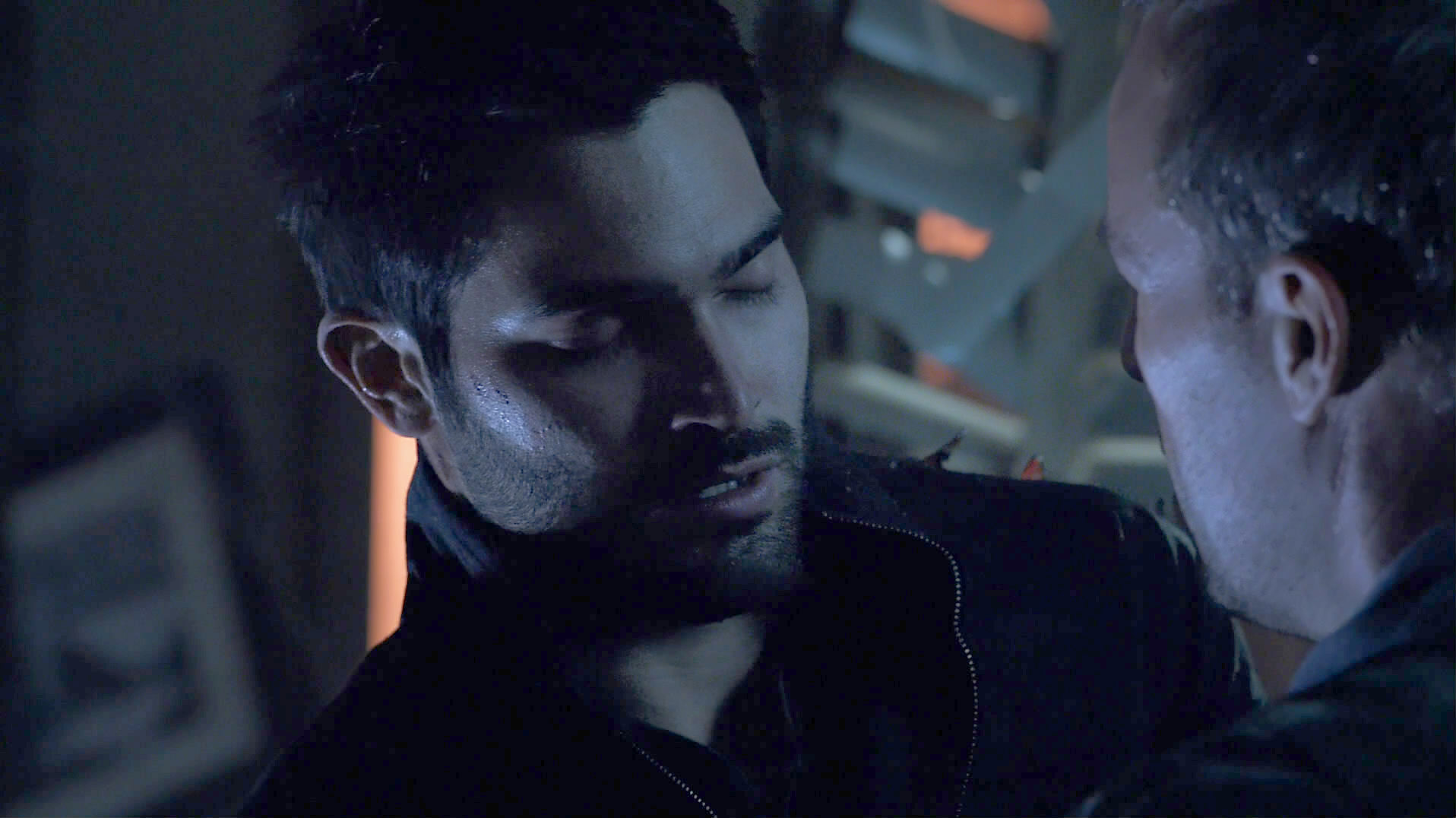
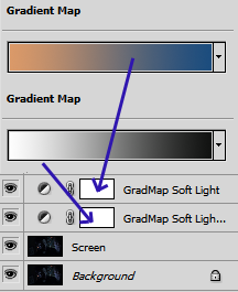
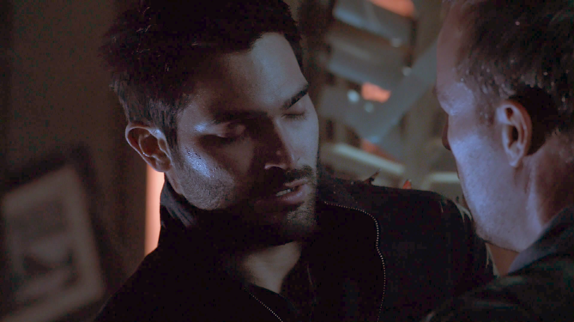
The second example is with the B/W gradient plus another beige-blue gradient, just so you can see what's possible:
Last but not least: Coloring
In all cases, if the colors stray too far from the original, you can always copy the original layer again and set it to Color:
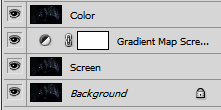
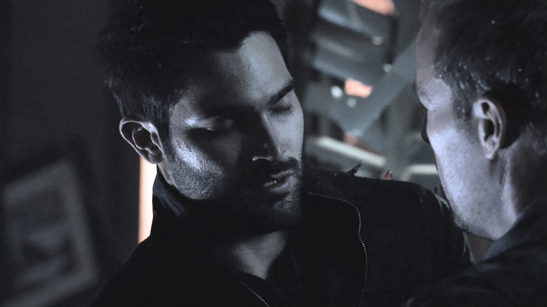
Final Result
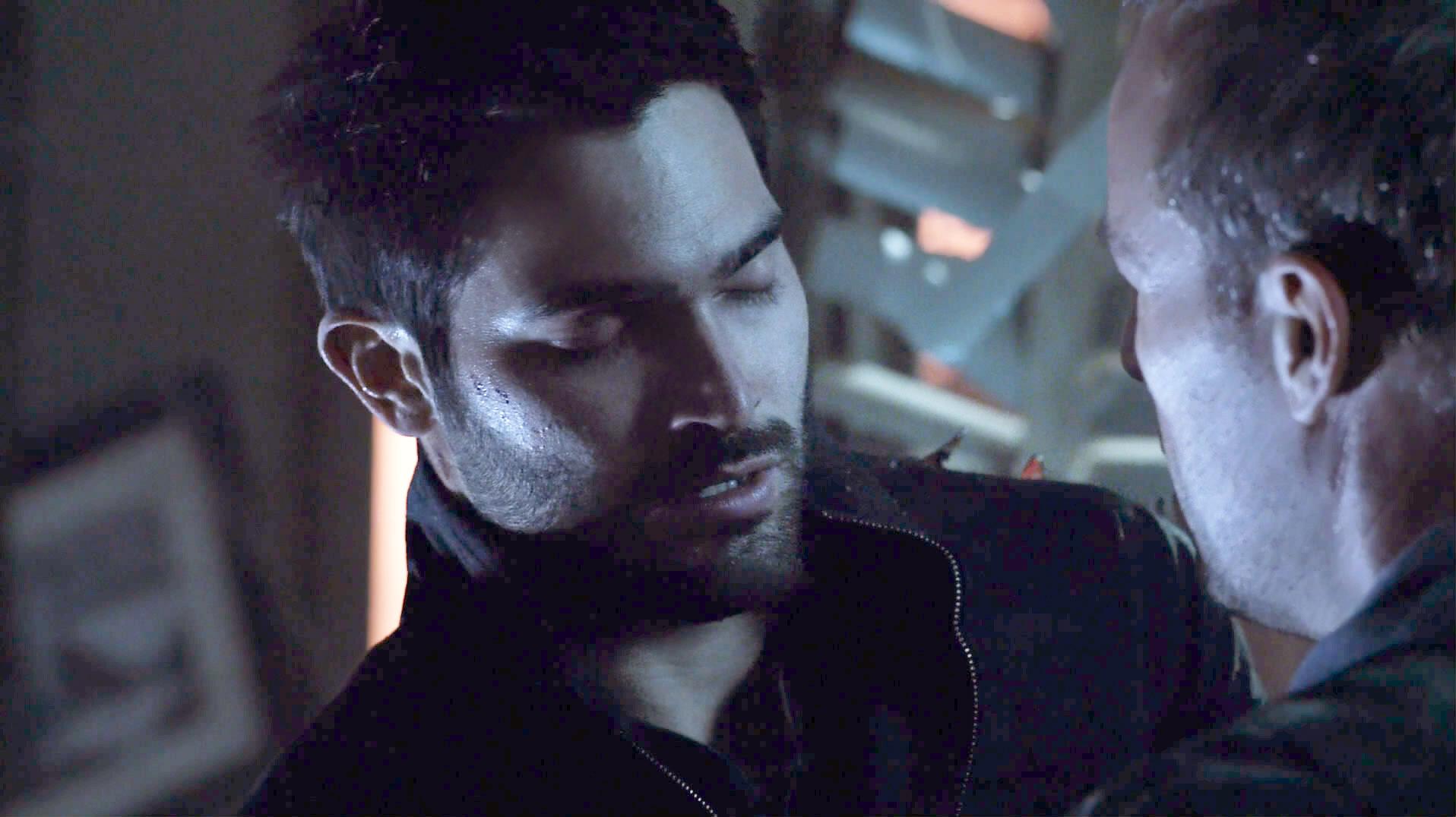
Here's the final result that I would be happy with in this cap and from which I could start making an icon (on second thought, maybe his cheek is too bright already).
Unfortunately, the dark parts were lightened so much in the end that they're full of visible jpg artifacts. So I smoothed those on his forehead and nose with the smudge tool. You can still see the original artifacts on his shirt and on the background. I'm afraid there's no easy way to avoid those (except not lightening the cap as much ;)). You'll have to get rid of those by some other means that are not part of this guide. Dark caps are just always a bit more work.
As you can see, I combined several of the methods. The three screen layers are set to 100%, and the other ones to 40% (the ones I marked in the layer screenshot) :
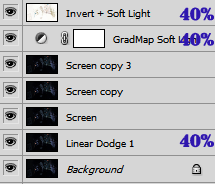
Phew! Most caps don't need that much preparation. I just chose the worst cap I could find on purpose. :D
Remember: every cap needs different settings. The trick is to combine the different methods and play with the adjustments until the result looks good to your eyes!
Okay, so this is all I know. :D I hope that this was helpful!